Your Guide to Information Architecture How to Create a User Centered UX Design
With 1.5 billion websites on the web today, the internet has become a very information-dense place. This, in combination with humans’ decreasing attention span, created a new concern for web design. Websites no longer compete for the information they offer, but rather on how they deliver that information. As a result, web designers needed a new way of structuring and presenting information. That’s how Information Architecture began.
Writer at Harbour.Space University
With 1.5 billion websites on the web today, the internet has become a very information-dense place. This, in combination with humans’ decreasing attention span, created a new concern for web design. Websites no longer compete for the information they offer, but rather on how they deliver that information. As a result, web designers needed a new way of structuring and presenting information. That’s how Information Architecture began.
Think of a time when you had to click through more than five links on a website in search of information, only to come up empty-handed. This is the outcome of weak information architecture - a frustrating experience for the user. No one wants that.
To avoid losing users, designers organize content into easier-to-consume systems. The science of structuring information, features, and functionalities in digital products is information architecture (IA). IA is a fundamental concept that UX designers should master before they begin any visual design work.
This article examines information architecture and the role it plays in design. By the end, you will have the knowledge, skills, and tools needed to conceive your first information architecture diagram.
Are you ready to see what your future can look like in information architecture?
What Is Information Architecture
Information architecture is the science of organizing, prioritizing, and labeling content to structure digital products. Visualize it as a blueprint of the product's infrastructure and features. A UX designer uses information architecture to deliver those to the user in a way that’s clear to understand and simple to navigate.
Think of your favorite website or app. Now try naming information types, features, structures, and content that go into the platform. If you had to draw how all of those elements work together, where would you start? That’s the job of an information architect.
When you open applications with good IA, chances are you won't feel the complexity of the elements. The surface looks simple and easy to understand.
― Donald A. Norman, Author of The Design of Everyday Things.
For this reason, information architecture is important. When done right, IA helps people find their way. It makes digital products useful, understandable, and long-lasting.
The Role of Information Architecture
Information architecture falls under the responsibilities of a UX designer.
A UX designer's main focus is to create a user-centered experience. To achieve this, the designer starts by creating a skeleton navigate a web page. This structure is known as information architecture. It sets the relationship and links between the different elements.
Think of any architecture design. This blueprint is the visual deciding where to place stairs or doors to connect elements of a building.
The same structure needs to take place for designers. Because when you combine UX design and information architecture, you get a user-centered experience. This functional system helps users navigate your system relying on the foundation IA work you create.
Without the IA foundation, compelling content and user interface design fail. That's why a designer must have a good dynamic between functional design and architecture. It guarantees high-quality digital products.
What Is the Information Architecture Process?
The first step in any user experience design project is research. Understanding both your project and audience is the foundation of your design work. You can learn more about the different steps of UX design here.
Being aware of the needs and intentions of your audience helps you set up your information architecture.
Information architecture has four main systems. These systems make it easier for you to break down the information and present it in the right format.
Here are the 4 main Information Architecture systems you can use to organize your project:
- Organization system
- Labeling system
- Navigational system
- Searching system
We will explore each of these systems to help you identify how they can best help your project.
The Organization System
As the name suggests, the organization system aims to organize information. There are many ways you can divide and classify information. An organization system gives you a framework to follow so that your product makes sense to your users.
The organization system can have one of these structures: hierarchical, sequential or matrix.
1. Hierarchical Structure
The hierarchical structure uses visual indicators to assign importance to the different elements of a design. Using color, size, contrast, shape, alignment, and other visual clues, you can make some elements more prominent than others.
The hierarchical structure relies on the brain’s ability to experience visual design as a whole rather than parts. In other words, our brain doesn’t analyze elements individually when looking at a design. Instead, it takes in the whole picture, making it easier to make some parts of the design attract more attention than others at first glance.
This structure aims to direct the user’s attention to more important elements and to stimulate the brain's next interest point.

2. Sequential Structure
The sequential structure draws out the possible journey a user could follow. It's a sequence of actions a user takes to reach a goal. This structure is very common in retail and food ordering applications. One popular example is the process of ordering a pizza.
When ordering a pizza online, you follow a set process. You first decide your size, crust, cheese, sauce, toppings, then you proceed to payment. The platform takes you on this intended journey for you to complete your purchase.
Here the information is presented in a sequence that fits your expectations or needs. The order is not arbitrary; each of the steps is carefully placed to make the experience smooth and help you reach the end of the process.

3. Matrix Structure
The matrix structure is a bit more complex, as the navigation is in the hands of the user. A phone interface is a perfect example of a matrix structure. In this case, the architecture is customizable - in fact, the more customizable the homepage, the more time the user will spend interacting with it.
The user has choices for organizing the information, and can use different variables to sort and arrange it. For example, the user can decide to view information by date or type. This changes not only the information structure but the interface of the platform.
This structure is used when there are multiple paths that a user can take to get to what they need. Usually, when using a matrix structure, you don’t have a specific point you want users’ to reach. The objective rather is to get them to explore and interact with the design.

Labeling System
Labels work like containers - they assemble a large amount of information under one tag. In design, these tags can be represented by headers as an example. A header can signal that there is more content and information inside.
For example, Harbour.Space University has nine unique programs. The home page displays the only names of the programs and a brief description. Only after clicking on the heading do you get access to all the content and information related to that title or label.
Under the program page, you will also have access to other pages such as faculty and blog that are also under the same label.
This helps sort data on the back end, but also presents a great experience for the user.

Navigational System
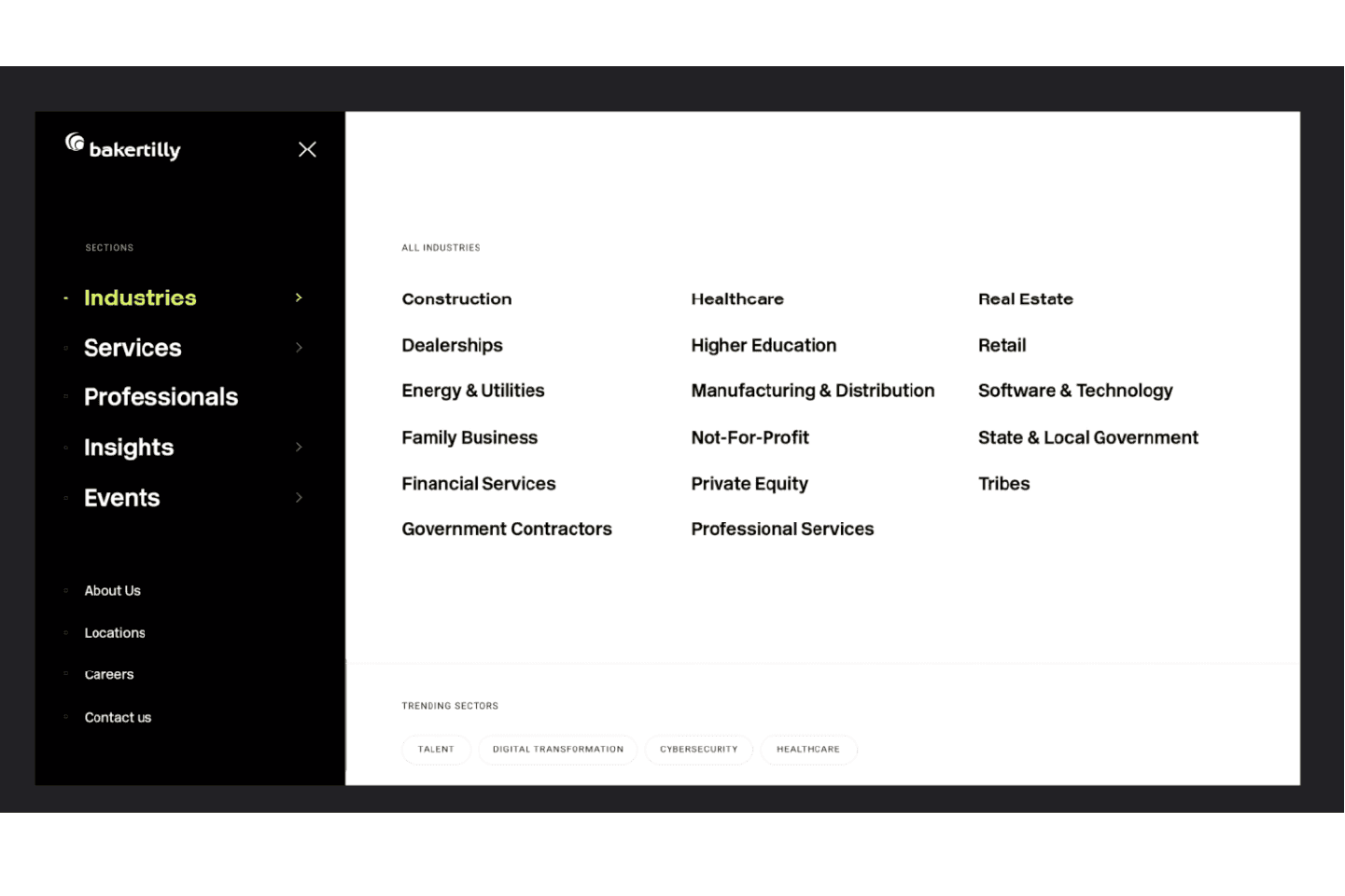
The navigational system determines how users travel through your content. This system determines how the pages interact with each other and how accessible the content is. A good navigation helps the user explore the website without getting lost.
These navigational systems can be:
- Global or site-wide, like navigation bars on a homepage with links to other sections of the same website
- Local, which helps the user navigate through different sections of the same page
- Contextual, which can vary but an example of which is moving to a different website
Let’s take the example of Baker Tilly. This web page has sections categorized into industries and trending sectors.
Searching System
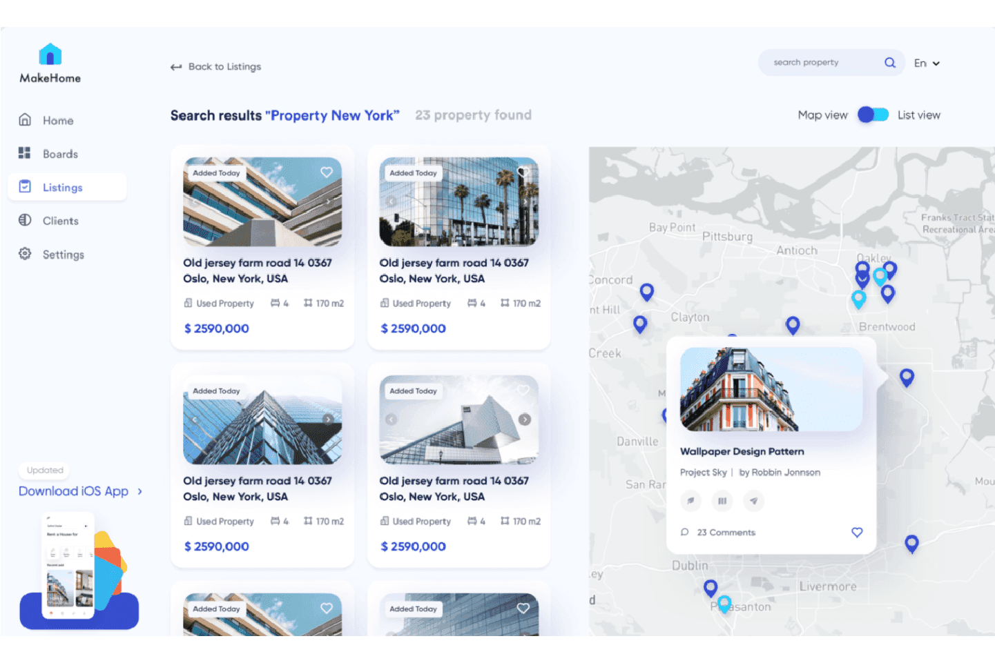
A searching system helps users find specific content or related content using keywords. This system relies on a keyword-driven search engine or a set of filters to help discover content.
Real estate websites are a good example for this type of system, as finding the right apartment on a website relies heavily on a searching system. Not all listed properties are on one main page - the list would go on forever, and you would never see any of your interests. That's why architects gather information from each property, then create filters for pricing and features which save users time and headaches.
After understanding the different systems and structures, you will have a better idea of how to organize your information. You can polish your plan by making sure you have answers for these five questions:
- How do you organize and distribute data?
- How do you present information?
- How do you communicate the way you navigate through the app?
- How does the user navigate the application?
- How does the user look for information?
The Best Tools for Creating an Information Architecture Diagram
The market saturates with online tools for creating an information architecture diagram. To make is easier for you, we curated a list of the tools we tried and liked:
Miro
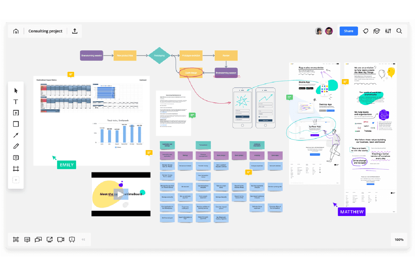
Miro is a real-time whiteboard for visual collaboration. This tool is popular among remote workers. It helps bring teams together for ultimate collaboration from anywhere. They have a free version with an unlimited number of collaborators with plenty of features, but the free version has a limit in the number of projects though. It still remains a great tool to start with.
Lucidchart
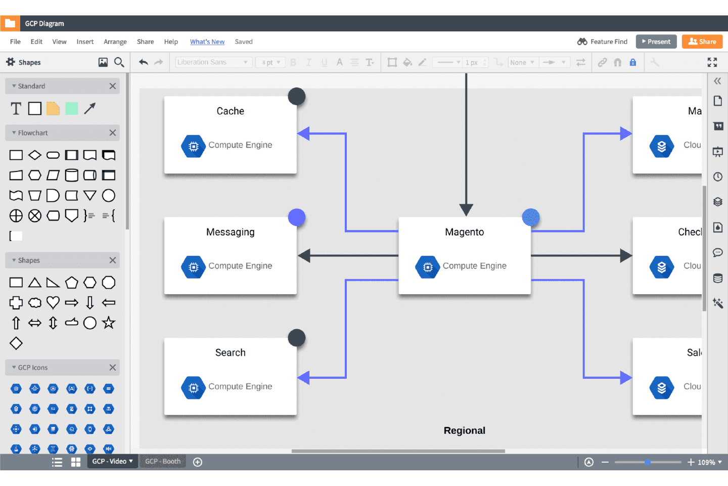
Lucidchart is an online diagram software and visualization tool recognized by top brands. This tool has both personal and business plans to choose from. It starts with a free option for 100 basic templates.
Xmind
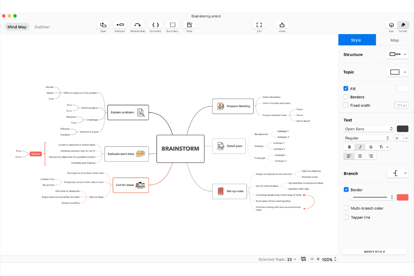
XMind is a mind mapping and brainstorming tool. It's used by remote teams and top global brands. The downloadable tool streamlines across all devices and offers a discount for academia.
Coggle
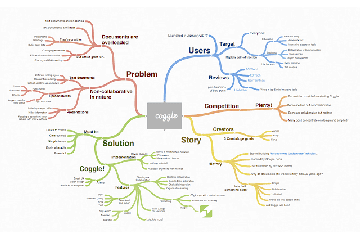
Coggle is a collaborative mind map and flow chart tool. It’s a great tool for sharing complex information in a clear way. Coggle has pricing plans starting with a free option for unlimited public diagrams.
I Completed an Information Architecture Diagram, Now What?
They say that a designer’s work is never finished, and that holds true when it comes to information architecture. The IA blueprint isn't made of stone; it's made to be adaptable to your business’ growth. With time, your audience’s needs change and new developments appear, however, the structure remains. Meaning, no new code or prototypes are necessary.
This aspect of IA makes it a powerful time saving practice and an ever-evolving discipline. Because of this, corporations like IBM and Marriott offer Information Architects jobs with very competitive salaries.
Think about it. IA are the gatekeepers of the operation map for digital systems. Their knowledge is essential for helping drive teams to make the best decision. In return, this helps business growth.
The Biggest Takeaways
- Information Architecture (IA) is the science of structuring information, features, and functionalities in digital products. It helps users navigate through a digital product and improves their experience while using it
- IA has 4 main systems that you need to consider as a designer when creating the framework for a page: Organization, Labeling, Navigation, Searching
- There are a variety of tools available to help you map out your digital product’s Information Architecture
If you’re interested in the intersection between UX and UI design, check out Harbour.Space’s Interaction Design program, taught by remarkable leaders in the industry. Feel free to get in touch with us at hello@harbour.space for questions or collaboration opportunities.
Thanks for reading
If you're interested in further growth, take a look at our website to learn what your future could look like at Harbour.Space. Lastly, get in touch with us at hello@harbour.space to let us know your thoughts!
