Designing for the dynamic web top 10 designs from layout class with Anton Repponen
We live in a dynamic world. Everything on the web is an interaction, there is a motion to it, a fluidity that hints at what happens if the user completes the gesture.
We live in a dynamic world. Everything on the web is an interaction, there is a motion to it, a fluidity that hints at what happens if the user completes the gesture.
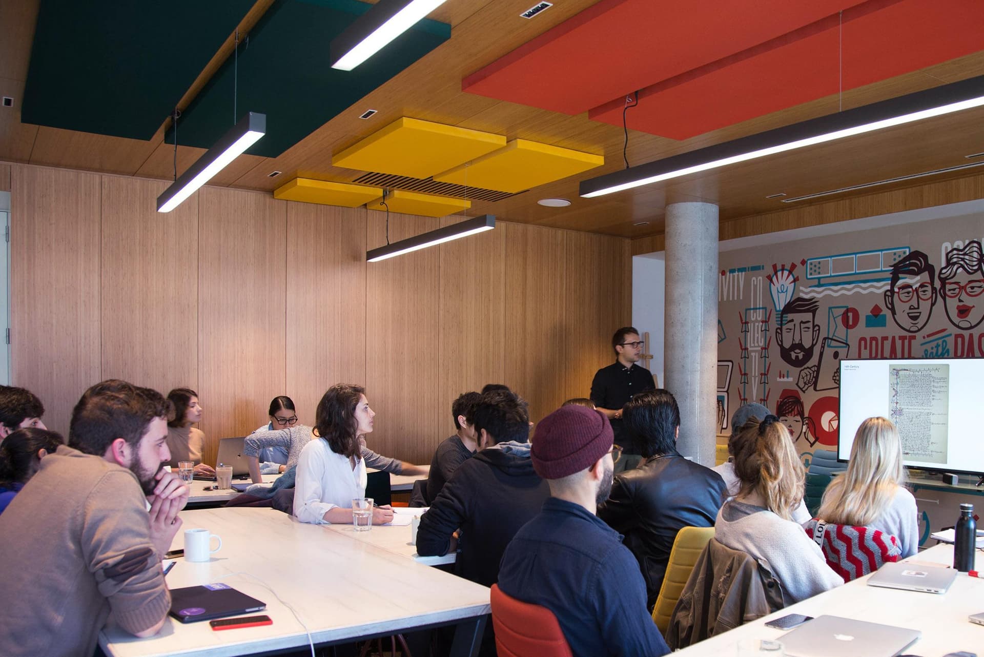
Anton Repponen, creative director and co-founder of Anton & Irene, spent three weeks at Harbour.Space to immerse us in the art of visual design. Anton, who is also the programme director for Interaction Design, applied his expert insight and worldly experience to fashion us into young designers who could create for dynamic environments.
The main goal is to teach students how to organise information in a way that it is readable, it’s clear, it looks good and is interactive,” Anton shares about the course. “The class is designed to teach students to understand how to distil information. It is important to help explain your ideas visually.”
DESIGNING FOR THE DYNAMIC WEB
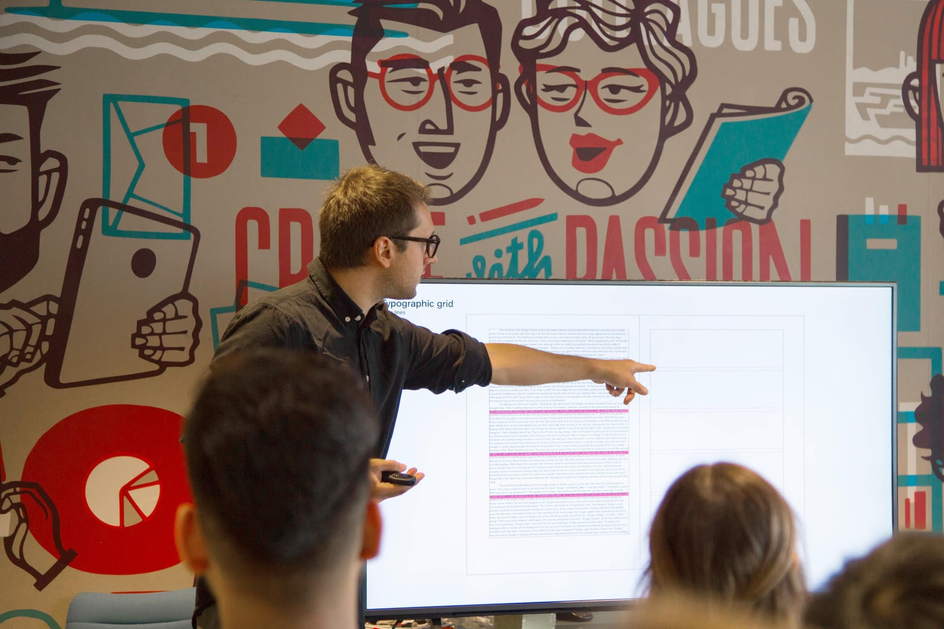
“People still think of the web as a piece of graphic design”, says Anton. “Instead, people should be designing for the dynamic web”.
Designing for the web can mean designing in metaphors. It is crucial to a use a consistent metaphor throughout all the designs. This should also be parallel to the style guide of the client, and the metaphor should be congruent across all platforms and mediums, whether designing for desktop, mobile or tablet. The style guide document also informs you of the chosen typography, colour scheme, hover state of the buttons etc.
The interaction model is the glue that holds the content and layout together, and transitions from one layout to another,” says Anton. An interaction model is a design model that binds an application together in a way that supports the conceptual models of its target users. It defines how all objects of navigation relate and orientate users.
Motion can solve hierarchical and spatial relationships between elements and enhance the experience on the web. But this does not mean that your website needs to light up like a Christmas tree. Not everything needs to be animated. Rather have a cohesive animation metaphor that animates key features in a unique way, such as a loading bar or a call to action, to help guide the user through the site.
Designing for a dynamic site in 2018 also means taking the context of the audience into consideration. You may be designing for different languages or cultures, and your site needs to be flexible to those needs.
We applied all of the lessons in Anton’s class to design and construct our own dynamic websites. The class had us thinking about the best vehicles to communicate certain pieces of information, whether it’s text, video or an infographic, and how to drive that vehicle through the dynamic web.
The task was simple:
“We are a new online publication exploring life and culture through thematic, visually- oriented international coverage and commentary. We are looking for name suggestions for our new online publication and initial art direction. We are looking for some concepts for our online publication based on several core layouts and smart ways to integrate sponsorships (no standard banners).”
For three weeks we poured all our hours into the designs. We are a multifaceted class from all over the world and different backgrounds, including engineering, architecture, UX design, graphic design, journalism, tech and marketing. These diverse backgrounds revealed themselves in the spectrum of the designs submitted by our class.
HERE IS THE CLASS OF 2018's NEWS SITE DESIGNS:
1.‘Labyrinth’ by Pavithra and Shivani:
Labyrinth was designed by MA Interaction Design students Shivani Sawant and Pavithra Krishnan. This funky news website explored news ways of portraying news with a playful interaction model for the readers to engage with the material.
2. ‘Paper Sloth’ by Yiwen Yan:
In the modern day, no one has the time to read full news articles. Research points to a shorter attention span where readers favour articles of 300 words. Paper Sloth, designed by MA Interaction Design student Yiwen Yan, is to provide readers with quality content instead of quantity. There is no rush, take all the time you need to enjoy reading.
3. ‘Six Degrees’ by Soninke Combrinck:
“I questioned what the news culture was essentially about, and I realised it’s the people. I also dug deeper to see what motivated people to visit news sites, such as for entertainment or to learn something new. I wanted people to to enjoy exploring news stories in a very visual way,” says Soninke Combrinck, MA Interaction Design student.
4. ‘EVE Zine’ by Rebecca Bossart:
EveZine is an online publication that explores the intersection between design, research and technology. It is about becoming better designers by understanding humans better and building great tools. Rebecca Bossart is a MA Interaction Design and the founder of Eve, a platform created to support and streamline the research process of UX designers.
5. ‘EVE’ by Juneza Niyazi:
“I was questioning how content is consumed on the web. So I was designing for skimming and not reading. Because there is particular behaviour pattern when people read on the web versus a book. The mindset of people on the web is to research or look for things what they are working on or thinking about. My research was based on the psychology of readers on the web,” says Juneza Niyazi, MA Interaction Design student, and co-founder of EVE.
6. ‘Spyglass’ by Iason Chatziioanou and Nicolas D'Auria:
“People explore things that interest them, things that they like, things they find intriguing. Searching for knowledge is an exploration, finding it is the treasure. This became the foundation for Spyglass - we wanted to recognize and celebrate the search for knowledge,” says the dynamic duo, Iason Chatziioanou and Nicolas D'Auria, Master’s students in Interaction Design and Digital Marketing respectively.
7. ‘Ugly’ by Boris Peshev:
Ugly is a news website that revolves around art and culture. It’s a bit of a cliche but the core of the brand was to find the beautiful in the Ugly. The black and white colour scheme was selected so that the artwork/articles, which will be vibrant, can be showcased in the best way possible. Ugly is very brand driven where the logo appears on many occasions throughout the site, to make it feel as one whole. “The design is very graphically driven where the site, especially the article pages, feel almost as a print/poster design. This is due to the varying typographic elements I included through every page,” says creator of Ugly, Boris Peshev, MA Interaction Design student.
8. ‘Nuts & Bolts’ by Tessa Vardy and Olivia Engelhardt:
“Nuts & Bolts is a exploration of color and shape through design. We want to bend the ordinary and do something different, to keep the user exploring and not let their attention drift one,” says Tessa Vardy and Olivia Engelhardt, both Bachelor’s students in Interaction Design. Explore the Nuts & Bolts homepage on ReadyMag, or read their long form feature article ‘10 Designers on their Favourite Dining Chair’.
9. ‘Quoi de Neuf’ by Nadine Kabbara:
Quoi de Neuf stands for “What’s up?” in French, which is where the concept of this magazine came from. The simple, playful design invites you to read the news without feeling overwhelmed by the jam-packed traditional newsite design. MA Interaction Design student, Nadine Kabbara, wanted to create a fun environment in which to consume your daily news.

10. ‘Merc’ by Pedro Bare:
‘Merc’ was inspired by the the “return of analogue and old newspapers”. “I wanted the homepage to be reminiscent of a newspaper,” says MA Interaction Design student, Pedro Bare. “The section I like the most is where I highlight the writers and made them look like sketches which doesn’t make the task of highlighting authors boring it makes you want to click on their profile and uncover more.”

Thanks for reading
If you're interested in further growth, take a look at our website to learn what your future could look like at Harbour.Space. Lastly, get in touch with us at hello@harbour.space to let us know your thoughts!